Dermosil
Dermosil Webshop
Redesign
The company
Dermosil is Finnish company that produces and sells skincare and makeup products. It is online store operating in 5 countries.
project goal
Website was outdated, thus we wanted to create versatile design system which would be intuitive and easy to maintain. Primary goal was to establish design framework which would set foundation for all sections of website. My role was to create UI/UX design for the project.
Home, product catalog and presentation pages before redesign.
strategy
We started with big picture in order to identify problematic areas. This phase included communication with stakeholders, competitor analysis, user needs research and information architecture. As soon as requirements and scope became clear we started working towards more substantial prototypes and final designs.
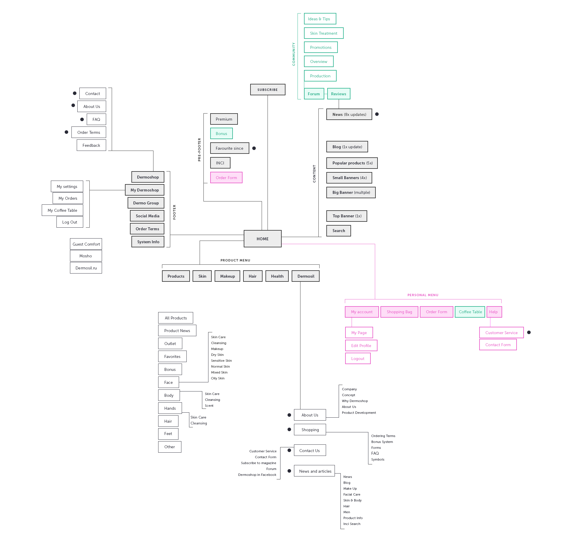
sitemap reorganization
UX challenges
- Homepage carousel had poor usability - animation was too quick and user wasn't able to control it manually. Also each image had to be designed, localized and uploaded separately.
- Too many links in navigation, it was poorly organized, confusingly named.
- Product presentation lacked appeal. It didn't provide optimal sized images, descriptions were presented in long chunks of text.
UX SOLUTIONS
- We decided to give more control for user by slowing animation and providing ability to switch between slides. We streamlined production of banners as well - image was set as a background and text was added dynamically on top, so it could be easily tweaked and localized.
- To aid discoverability, we established product categories and detailed filtering parameters that are intuitive and accurate.
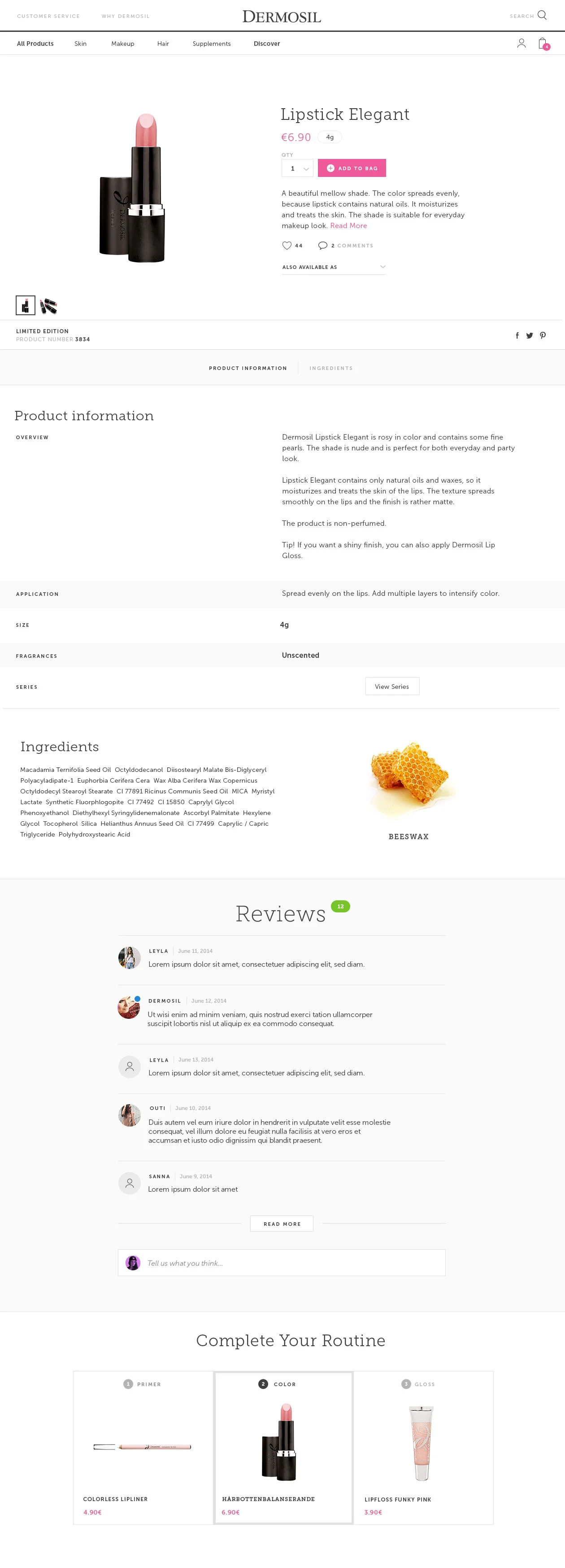
- To provide better product presentation we used principles of visual hierarchy. Key information emphasized, text divided into smaller readable pieces.
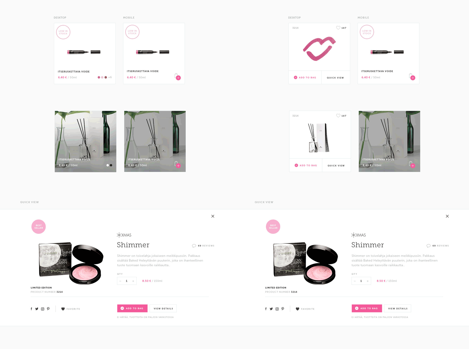
early prototypes of card structure
homepage
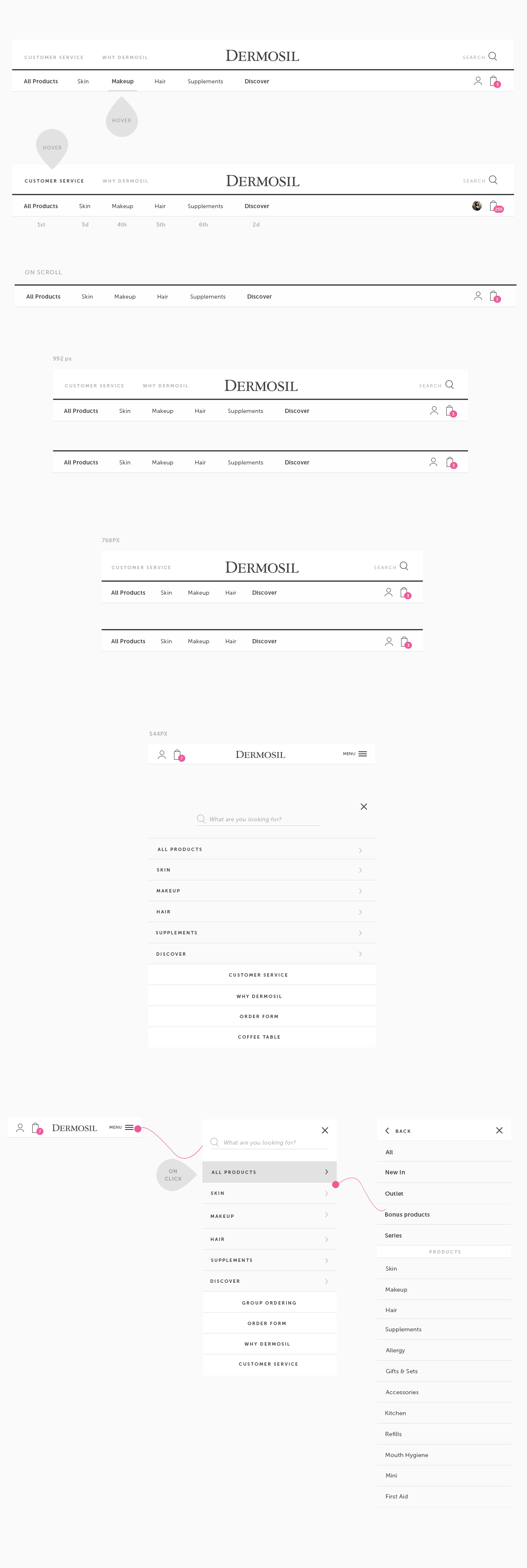
Header navigation
Pull-downs
search
Product catalog
product cards & quickview
Product presentation
Responsive
learnings
Important takeaway I got from this project is importance of data-driven approach. It helps to eliminate assumptions and deliver better value for people. It is a collaborative process, therefore time management and communication helps to create better online user experiences.


